


INITIAL
DESIGN
THE BEGINNING STAGES OF DESIGNING THE APP
MOODBOARD & TYPEBOARD
The moodboard and typeboard were chosen to represent Keith Haring's use of line, color, and shape in his art. The moodboard focuses on bright color, pattern, and interactivity of places such as the Color Factory.
The typeboard explores bold, colorful type, with sans-serifs and geometric typefaces used in various ways. These type examples are clean and modern yet expressive, mixing clean typography with color, line, and the contrast of the two.

Describe your image.

Describe your image.
Describe your image.
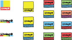
LOGO EXPLORATIONS
Various logos were explored based on Keith Haring's art and style. Many iterations of these logos were attempted, using everything from his iconic symbolic imagery to the logo that accompanied his signature to use of shape, color, and pattern. The selected logo features Haring's Crawling Baby crawling into a yellow box, symbolizing the artist crawling into the users phone to share his thoughts.
 |  |  |
|---|---|---|
 |
Feature
Priority
Features for the app were decided by analyzing what was considered a Must Have verses Nice to Have on the y-axis, and Low Effort verses High Effort on the x-axis. This ensured we were getting the most essential features included in the app compared to the amount of effort those features would take.


USER FLOWS
The following user flow diagrams are intended to show how a user progresses through the app when trying to complete a task.
The first user flow shows how a user would navigate, draw, select color, and post to the graffiti wall.
The second user flow shows how a user would navigate to, select a photo, edit, and post to the "Keith Yourself" gallery.
The third user flow shows how a user would navigate to, select a symbol, view information, and see related images to one of Keith Haring's many iconic symbols.
 |  |  |
|---|
VISUAL SYSTEM
The visual design of the app takes cues from Keith himself, utilizing, hand drawn shapes, icons, and patterns that were common throughout his work. The colors were chosen based on the most common colors he used, tinted shades of primary and secondary colors, used in contrast with each other. Typography was selected to reflect Haring's style as well. Cubano gives the feeling of a hand drawn sans-serif, while Gotham provides structure and stability, while representing Keith's adopted hometown of New York City.
 |
|---|
SITE MAP
The site map gives an overview of the app's navigation and how all screens are linked to each other. In the case, all sections are accessible through the menu, and the sections move linearly from there.
